ShopDreamUp AI ArtDreamUp
Deviation Actions
Exclusive Content
Starting now, I'll be posting some special exclusive posts that people can view for a small fee. Everything here will be SFW! This can include tutorials, hidden literature and artworks.
$5/month


Suggested Deviants


Suggested Collections


You Might Like…


Featured in Groups


Badge Awards
Description
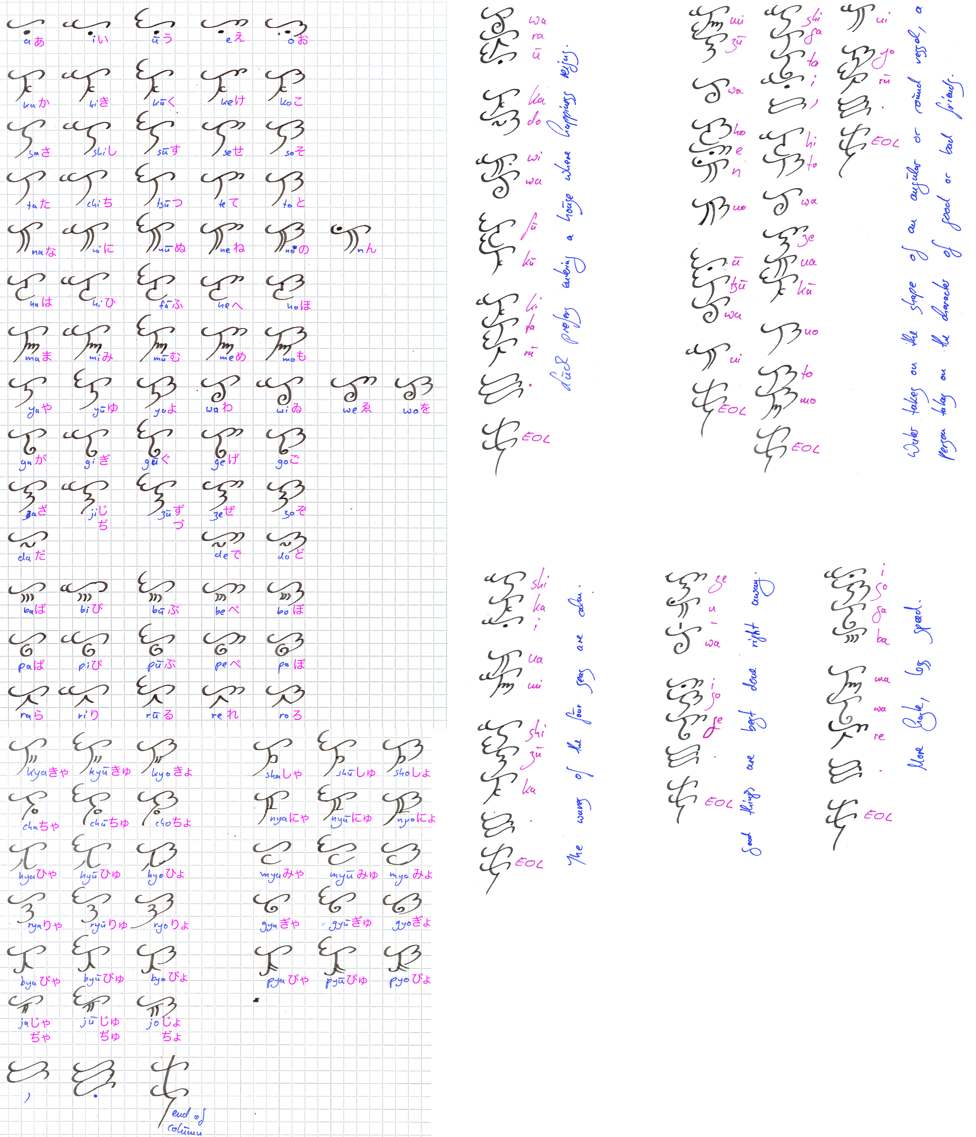
When a friend and I started a fantasy roleplay set in a world inspired by the Japanese middle age, we decided to use the Japanese language as a base for the language spoken there. I had this script laying around and expanded it so Japanese could be written with it.
The land is called Kawariku (which is short for Kawa no Riku, Land of Rivers).
Basically, it's an alternative writing system for Hiragana. You can use it to write anything that can be written with Hiragana.
The syllable's vowel is determined by the meta level (the top bar, called ooeda or branch). A is meta level 1, i is level 2, u is level 3 and so on. Now, originally, it was different. It was a = 1, e = 2, o = 3, i = -1, u = -2. But that's too complicated. The consonant(s) are determined by the root (kon).
While it can be written horizontally and vertically, the latter is more common. Commas are two meta-1 branches combined, periods are 3 meta-1 branches. Dashes can be written like normal dashes (– if the writing is horizontal, | if it is vertical). Eventually, when writing vertically, it's common to use a special "end-of-column" character at the end of each column. It is not necessary, but it's usually done if one writes in "blocks" that are placed above or below other "blocks".
Esthetically, the glyphs are more consistent, while in Hiragana, most glyphs that share the same vowel or same consonant don't resemble each other at all.
Btw, hope you can read my handwriting. This is several sheets of paper scanned and then put together. I was too lazy to type everything again with the computer.
Image size
2000x2329px 2.47 MB
© 2012 - 2024 Irolan
Comments16
Join the community to add your comment. Already a deviant? Log In
\m/